How to Find the Default Dominant Color Theme in Any Squarespace 7.1 Template (And Why It Matters)
Customizing colors in Squarespace 7.1 can be confusing for new website owners. One of the most common frustrations for beginners is:
"I went to Site Styles > Colors, changed the background color of 'Lightest 1', but absolutely nothing changed on my live website! Why?"
The reason is simple: Squarespace 7.1 generates 10 distinct color themes (Lightest 1 & 2, Light 1 & 2, Bright 1 & 2, Dark 1 & 2, Darkest 1 & 2) from a single 5-color palette.
When a template designer builds a template, they choose one specific theme as the dominant (base) color theme and apply it to 80% to 90% of the sections across the homepage, blog posts, and product pages. If your template is built on Dark 1, tweaking Lightest 1 will never change your pages until you know where and how that theme is applied.
Understanding and identifying your template’s dominant color theme saves hours of trial and error and helps you choose the right template from day one.
3 Big Benefits of Finding the Dominant Color Theme
1. Choosing the Right Template Upfront
Before starting a website, knowing whether a template uses a light, dark, or vibrant dominant theme helps you pick the right design for your brand. If you want a sleek, dark aesthetic, picking a template whose dominant theme is already Dark 1 or Darkest 1 means you will not have to manually change every single section background across all your pages.
2. Fast, 1-Click Sitewide Rebranding
When you know which theme is the dominant one, you only need to edit that single theme under Site Styles > Colors (by clicking the pencil icon next to it). Because that dominant theme is applied to almost every section on your site, tweaking its section background, headings, and paragraph colors will transform your entire website in just one click.
3. Eliminates Guesswork When Adding New Sections
When you add pre-built block layouts to your pages, knowing your dominant theme ensures you know exactly how new content will look and match the rest of your site seamlessly.
How to Identify the Dominant Color Theme (2 Easy Methods)
Method 1: Check Section Settings (The Most Accurate Method)
You can quickly identify the active theme of any section—whether on your homepage, a blog post, or a product details page—using the section settings bar:
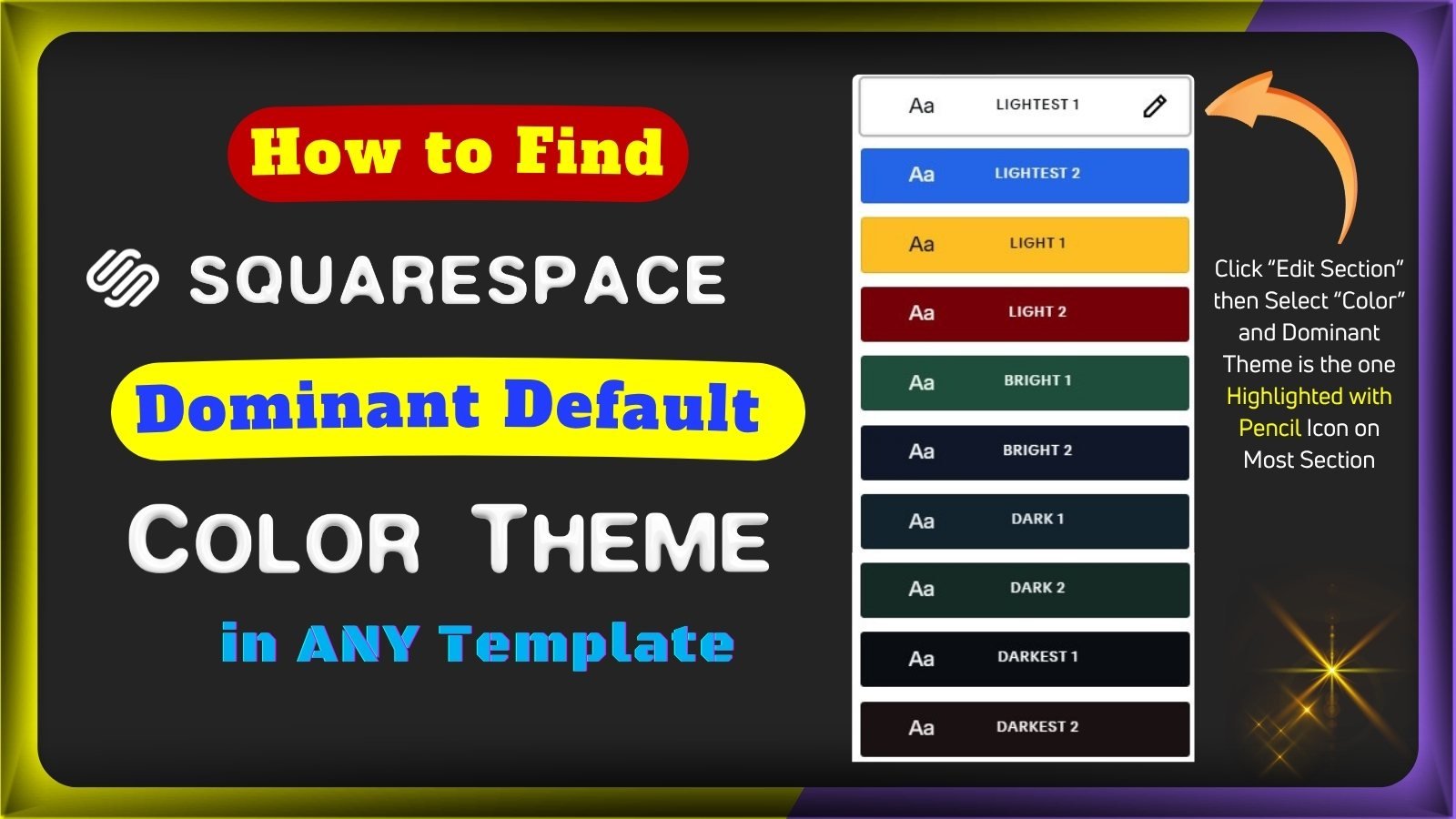
On your homepage or a blog post, click Edit in the top-left corner. Hover over the top-right corner of any section featuring your site's most common background color, then click Edit Section (the pencil icon).
In the section editor panel, select the Colors tab.
Look at the list of 10 color themes. The active theme for that section is highlighted with a solid border box around it and displays an edit pencil icon on the right (e.g., Lightest 1, Dark 1, or Bright 2).
Check 2 or 3 other sections across your homepage and blog. The color theme highlighted with the border and pencil icon across the vast majority of your sections is your template’s dominant color theme.
Method 2: The "Add Section" Pop-Up Preview
Squarespace’s prebuilt layout browser visually displays your template’s dominant theme:
In page edit mode, click Add Section between any two sections.
A pop-up window will appear showing prebuilt design concepts (Intros, Contact, Gallery, Services, etc.).
Observe the thumbnail backgrounds: Notice that most layout cards in the pop-up are rendered using one primary background color (the template's dominant theme), with only a few accent/contrast options.
When you click and insert any prebuilt layout, Squarespace adds that section with the exact color theme shown in that thumbnail preview.
(Note on Section Duplication: If you click the Duplicate icon on an existing section, the newly copied section will inherit the exact color theme of the section you duplicated.)
The 80/20 Color Strategy: Dominant vs. Secondary Themes
Professional web designers rarely use all 10 color themes randomly. Doing so makes a website look cluttered and inconsistent. Instead, use the 80/20 design rule:
🎨 Use the Dominant (Base) Theme for 80% of Your Site: Apply your dominant theme to your standard body text sections, blog post layouts, product galleries, and service descriptions. This builds brand recognition and visual consistency.
🌟 Use 1 or 2 Secondary (Accent) Themes for 20% High-Impact Sections: Reserve a contrasting theme (such as a bold Bright 1 or a contrasting Darkest 1) strictly for high-priority areas:
Call-to-Action (CTA) Banners
Lead Capture & Contact Forms
Special Promotional Carousels or Announcements
Stop Struggling with Palette Contrast — Get Pro Colors
Getting your text, form fields, and carousel cards to look polished—while maintaining strict WCAG web accessibility standards so text remains readable—can be difficult with default template settings.
If you want a stunning, fully accessible color system without the headache of manual testing, explore our Premium Squarespace Color Themes.
✅ 100% WCAG-Compliant: Pre-tested contrast ratios for effortless reading on all devices.
✅ Ready-to-Use Palettes: Grab instant DIY theme copies or hire us for expert installation directly into your site.
✅ Custom Brand Integration: We balance your primary, secondary, and accent colors across all 10 theme matrices flawlessly.
❓ Frequently Asked Questions (FAQ)
Why didn't my page change when I edited a color theme in Site Styles?
Squarespace 7.1 has 10 individual color themes. When you change settings for a theme in Site Styles > Colors, it only affects sections that are actively assigned to that specific theme. If your page sections are set to Dark 1, editing Lightest 1 will produce zero visible changes until you either edit Dark 1 or switch your sections to Lightest 1.
Can I change a section from the dominant theme to another theme?
Yes. Click Edit on your page, hover over the section, click Edit Section (pencil icon) > Colors, and choose any of the other 9 available color themes.
If I edit a color theme, does it change that theme across my whole website?
Yes. Every color theme in Squarespace 7.1 is global. If you edit the background or text color inside Dark 1, every single section across your entire website that uses Dark 1 will update automatically.
How do I ensure my custom color theme is accessible?
Web Content Accessibility Guidelines (WCAG) require sufficient contrast ratios between background colors and text (minimum 4.5:1 for standard body text). Always test your custom hex codes with a contrast checker, or use pre-configured, WCAG-checked palettes to ensure your website remains accessible to all visitors.
More Resources
Check more resources which are helpful in designing a Squarespace website.
Get Squarespace Website Design Package on Turnkey Basis.
Explore Our Premium Custom Squarespace Color Themes for Your Website.
How to Change Squarespace Colors for All Major Blocks: Buttons, Forms, Carousel, Text, Social Links, Newsletter, Announcement Bar, Line, Links, Scrolling Text, Logo on Different Pages, Section Background, and Change Color Palette.
Method to Change Squarespace Colors through Color Themes.
Method to Change Squarespace Colors through Palette Editor.
Squarespace Color PRESETS: Method to Change Color.
Three Easiest Options for Color Selection on a Squarespace Website.
Squarespace support article for changing colors.
Methods of Font customization in Squarespace website.
Check more learning resources about Squarespace.
Join our Facebook Group about Squarespace help.
ExploreServices List offered by Dozro.
Download FREE Banners for Facebook, or YouTube, or other Social Media, or Advert Flyers.
Check Dozro Services List or visit the Homepage of our website.
Be sure to check out Dozro's social media platforms, including our YouTube channel and Facebook page.